For my brief, despite selection of great choices I have decided to create A series of wedding accessories, including a choice of featuring a wedding monogram, invitation, place card, wedding favours and packaging. I have chosen this option because the style and design of most traditional wedding accessories is one which I enjoy and is something that could be exciting and interesting to expand and experiment with.
My preferred choice: mindmap
Invitations: analysis
Before creating any work I spent lots of time analyzing the types of text that were expected with wedding invitations. These were usually the kinds of things used, regal, italics and classic types that were easy to read and pleasing to the eye. they usually flowed quite well and worked hand in hand.
Typography plays an important part in weddings, what with the information and presentation of everything, as well as themes and regal looking appearances of text, invitations etc. Here are a collection of type faces I have created and scanned in to initiate my type face style and initial ideas.
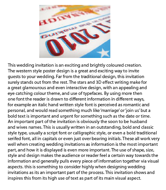
A development of ideas is key, for example adding colour and effects to those texts that work well, as well as assessing which work best and practicing, expanding and perfecting specific type faces to alter the appearance and design of initial ideas. For this development I have simply used the live trace tool, giving the text a smoother and more digitally enhanced look, as well as adding bright and interesting colors to denote a fun a kitschy style theme, highly influenced by this wedding package featured below
This is a great influence and interesting design as the combination of type faces, writing and design keeps the audience interested as well as eager to read on, making the most important part of the wedding invitation an enjoyable aspect of the invitation itself. I am also inspired and influenced by the idea of extra pieces of information such as a small book of facts on the couple, RSVP, keepsake and personalized envelopes.
The following texts are my designs with slight editing made to them, making them much more eye catching and interesting.
Here are a few more unedited typography designs that I created, I will go on to edit and develop more ideas to create various fonts and texts for a kitsch and handmade style.
With a bit of colour and graphic effects the typography and words really pop. The complimentary colours and pastel style theme I created with the colours creates a peaceful, playful and loving feel, as well as stepping up with its kitsch and creative design. My favourite words and texts featured here are firstly the 'Love', 'together, forever, always', 'invitation' and 'wedding' these are great italic texts that would work very well in the final design.
After experimenting with text I then created some hand drawn surface designs using floral patterns, this ties in with the handmade style as well as traditional wedding theme and design style. These surface designs could probably be left hand drawn, it would add a personal and interesting touch to the invitations, place cards etc. The pencil lines and shading create an interesting design and use of layers, colour thickness etc adds further dimensions that would lie beneath text.
 This artist Hennie Haworth has a distinct kitsch and hand drawn style. Much like my surface designs she uses outlines, colour and layering to portray an image with depth and style. The stamp like prints as well as the added details such as hearts and butterflies adds an extra detailing that would work brilliantly for a wedding theme. This piece inspires me lots as the variety of designs etc are very simple but look busy and eye catching when combined. As well as the text looking as if it were erased from the drawing is a great effect that inspires my approach and design altogether. The photoshop style is easily imitable and definitley a must do to try for my next development of ideas.
My attempts at Photoshop surface design
By experimenting more with pattern and style I was able to choose a theme that worked well for me. Here is a printing tile I made out of lino. This process included designing a print that would work well when repeated as well as cutting it out of the lino using a chisel. I then had to use ink based paint, and roll it out thin and flat on to an ink bed. Here I pressed my tile down and used a roller to distribute the paint evenly, then, I placed it onto my paper underneath the printing press and held it down for several seconds. I then repeated this process twice more to create the repetitive pattern. This was a mildly difficult task as the lines could often be difficult to create perfectly and the pattern was a hard choice. Although these problems arose I found the final piece very inspiring and interesting as an experimentation. The look of the tile when pressed is in a very bold red, the design is busy and looks great in an ink based print style. This could be used for something like an African themed wedding or even just a bold and bright ceremony.

This petal of a lily was a influence of design idea for my stamp. You can see the specific shape and detailing of the petal on the design itself that looks great as part of the whole image above.
Painting
Here are some more surface designs I created by painting in iridescent paint. I used a combination of techniques such as striping, flicking and twisting the paintbrush into different shapes and using various colours.
Here is some further experimentation I have done on the painting using Photoshop. This was done by changing the hue on the scanned image. It creates a variety of different colours by changing the appearance of the pigmentation, creating some great colours and vibrant patterns.

Here is another experiment created by myself. By simply cutting out
letters in different styles of text and colored papers, as well as
placing them in an aesthetically pleasing manner I was able to create
the perfect inspiration for my final piece. A hand made style is always
preferred by myself and also adds a great personal theme and style for a
wedding. Guests will often feel flattered to see such effort put in to a
handmade invitation. Although it would be made by the bride and groom
themselves it will still hold that personal and interesting hand made
theme. The brown paper and differing text for the word 'wedding'
highlights the important words within the text. Emphasizing the
importance of the day and occasion.
This is another example of my cut out letters for a birthday card I have
made. I think this is a great idea for a wedding invitation as there is
dimensions and levels to the text being 3D. This was done by using foam
double sided tape, which raises the cutouts and adds another level and
great effect to the card. I like the idea of it being 3D as it has both
texture and depth and initiates the eyes to look around at the card and
become excited at the images leaping out of the page. The effect of also
having the images veering off the side of the page is also innovative
and fun as it doesn't limit itself to the boundaries of the page, much
like the 3D aspect of the image.
This is yet another example of 3D creations. By using different shaped and textured stickers I was able to create a real cartoon garden like effect. the mismatched patterns and textures also created a kitsch and interestingly quirky feel that I hope to achieve with my wedding invitations. The use of flowers and nature also would work very well with a wedding theme.
By exploring different painting techniques I was able to find out my strengths and weaknesses in how I could portray this in my work. By including stuff I am not as good at I will be able to work on my skills as well as incorporating other techniques such as painting. The colors and text in this painting are a great influence for ideas such as portraits and painting of text on the invitations.
This paper bag design I found charming and interesting. For part of my party favours design I would incorporate some kind of box or bag design to hold them in. Something like this would work well as well as being eco friendly and very kitsch and old fashioned. The stamp like design is a great and interesting way to denote the wedding, but something Rob Ryan inspired would be also very fresh and non traditional.


